
Empowering essential businesses to run safely during the pandemic.


Empowering essential businesses to run safely during the pandemic.


Empowering essential businesses to run safely during the pandemic.
Case-study focus
User interface design, content design
Industry
Health
Softwares
Miro, Figma, Jira
Methodologies and Artefacts
content design
design system
developer consultation
prototyping
usability testing
user interface design
user research
Case-study focus
User interface design, content design
Industry
Health
Softwares
Miro, Figma, Jira
Methodologies and Artefacts
content design
design system
developer consultation
prototyping
usability testing
user interface design
user research
Case-study focus
User interface design, content design
Industry
Health
Softwares
Miro, Figma, Jira
Methodologies and Artefacts
content design
design system
developer consultation
prototyping
usability testing
user interface design
user research
Project overview: rapid testing support for essential services
During the COVID-19 pandemic, certain essential services (nursing homes, hospitals, and grocery stores) had to remain open. To help prevent the spread of the virus, these businesses were required to regularly test their staff using rapid antigen kits.
The Ministry of Health and a number of other ministries partnered with our user research lab to design and build the ordering system for these kits, which were distributed through multiple suppliers. We mapped out user flows and tested the ordering process to ensure it was intuitive and efficient.
My focus in this project was on building out the prototypes that were handed off to developers, and crafting clear, timely content to communicate service updates, especially during supply disruptions. This case study captures a snapshot of that work.
Key Process: Designing for complexity - multi-path flows and supply Chains
Mapping industry categories to the right user journey
The type of essential service requesting kits determined the applicant’s journey. Clear-cut cases like hospitals and dental clinics were routed directly to a distributor. Ambiguous services, such as environmental consulting or tourism, were reviewed before approval and assigned to a different supplier.
We mapped each industry category to the appropriate user flow. When new categories were added or existing ones updated, I adjusted the content and linked them to the correct path.
100+
business types supported
100+
business types supported
100+
business types supported
4+
suppliers coordinated
4+
suppliers coordinated
4+
suppliers coordinated
10+
user flow variations
10+
user flow variations
10+
user flow variations
Keeping developers aligned in a fast-changing environment
Navigating this project meant adapting in real-time to evolving public health guidelines and consequent distribution rules.
Navigating this project meant adapting in real-time to evolving public health guidelines and consequent distribution rules.
Navigating this project meant adapting in real-time to evolving public health guidelines and consequent distribution rules.
We needed a clear, reliable way to communicate with developers so updates could go live quickly and smoothly. What made this possible was daily standups, quick huddles, and well-annotated Figma files that showed which flows were archived, what content had changed, and where interfaces or interactions were updated.

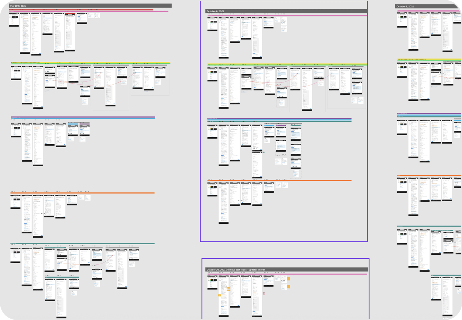
Well annotated Figma files and version histories made it easier to track and communicate changes to be made by developers
Writing for clarity in a crisis
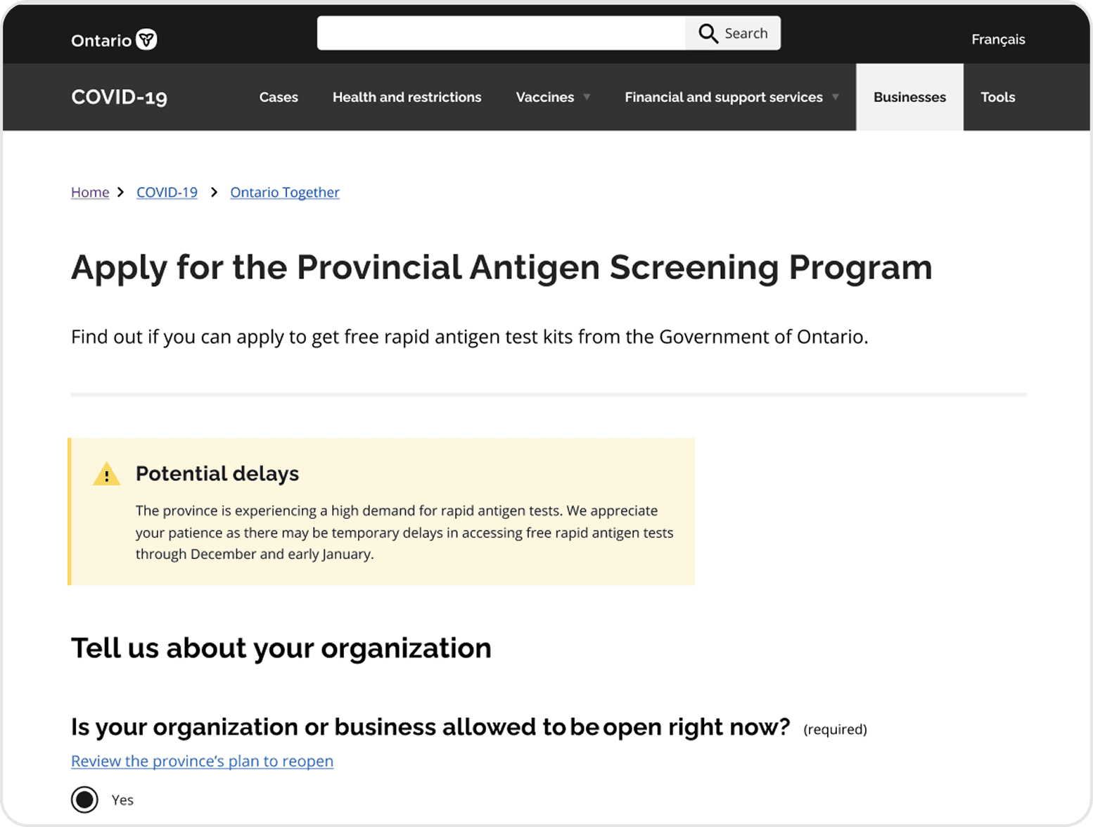
Every piece of content needed to be clear, actionable, and adapted to ongoing changes. As eligibility criteria shifted and supply chains fluctuated, users had to know exactly what to expect and what to do next.
Users checking eligibility, picking up test kits, or having them shipped all started on the same landing page. It was important to set expectations early; test kits weren’t always immediately available, and eligibility depended on the type of essential service.
We wrote content that guided users through each step, using alert banners and in-form messaging to make key details clear. The landing page content was broad and accessible to all applicants, while the form itself introduced more specific, supply-chain dependent instructions as users moved through the flow. Key content decisions were based on usability testing, where we learned that users often confused registration with placing an order, and struggled to understand their eligibility.
Writing for clarity in a crisis
Every piece of content needed to be clear, actionable, and adapted to ongoing changes. As eligibility criteria shifted and supply chains fluctuated, users had to know exactly what to expect and what to do next.
Users checking eligibility, picking up test kits, or having them shipped all started on the same landing page. It was important to set expectations early; test kits weren’t always immediately available, and eligibility depended on the type of essential service.
We wrote content that guided users through each step, using alert banners and in-form messaging to make key details clear. The landing page content was broad and accessible to all applicants, while the form itself introduced more specific, supply-chain dependent instructions as users moved through the flow. Key content decisions were based on usability testing, where we learned that users often confused registration with placing an order, and struggled to understand their eligibility.
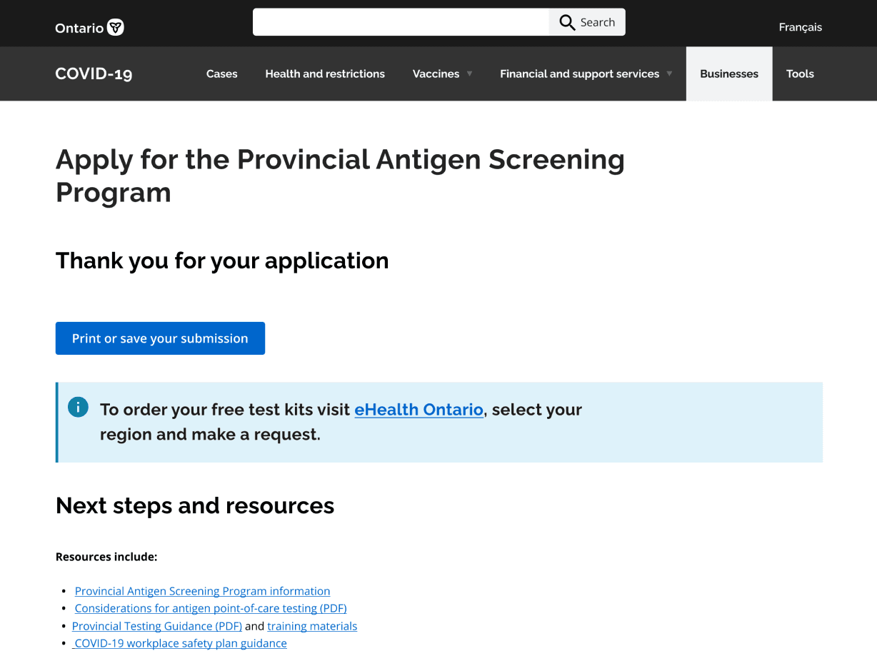
Alert banners used to communicate supply chain disruptions.


Variations of submission screens for different distribution channels. Micro-copy was edited on each screen to provide specific next step information.
Variations of submission screens for different distribution channels. Micro-copy was edited on each screen to provide specific next step information (images below).
Outcome and impact: supporting over 24,000 submissions
Ontario received 24,000+ submissions through the Ontario Together portal. 16,000+ emergency supply submissions have generated more than $211 million in purchases of critical equipment and supplies.
Ontario received 24,000+ submissions through the Ontario Together portal. 16,000+ emergency supply submissions have generated more than $211 million in purchases of critical equipment and supplies.
Ontario received 24,000+ submissions through the Ontario Together portal. 16,000+ emergency supply submissions have generated more than $211 million in purchases of critical equipment and supplies.
We conducted multiple rounds of usability testing to ensure essential services could easily navigate the form and access the test kits they needed. The result was a streamlined experience that helped reduce confusion, communicate delays, and support public health efforts during a rapidly evolving crisis.
Project reflections: what I learned
Design systems drive consistency
Efficient prototyping matters
Developer constraints shape design
A strong design system is essential for creating accessible, user-friendly interfaces. I saw firsthand how consistent spacing, typography, and hierarchy reduce cognitive load and improve navigation.
Using Figma’s auto-layout and components helped me build flexible, easy-to-update prototypes. Investing in well-structured files early on saved time as the project evolved rapidly.
Working closely with developers was key to implementing changes within platform limitations. I learned to adapt designs without sacrificing usability.
I acknowledge that this work was done on lands located on the traditional territories of the Wendake-Nionwentsïo, Anishinabewaki and Ho-de-no-sau-nee-ga (Haudenosaunee) peoples among other colonially occupied territories. As a settler, I hold privilege in being able to design experiences that impact indigenous folks. My aim is to curate experiences that are more inclusive and reconciliatory in regards to colonial impact by doing things like making sure indigenous voices are represented in the research and synthesis of the work I do.
0.32g of CO2 is produced every time someone visits this web page.
Wondering if I used AI (artificial intelligence)? AI was used sparingly to generate icons and copy edit (not draft) content for this webpage.